
I just saw the release of the Australian teams official outfit for the 2021 Olympics in Tokyo.
Ho hum.
Yes, another parachute design of yellow and green.
Why didn’t the designers draw on the beautiful Australian countryside, our flora and fauna and emblazon everything with eucalyptus leaves, the waratah or the mimosa? Why didn’t they take head from other sports and bring in an indigenous designed outfit?
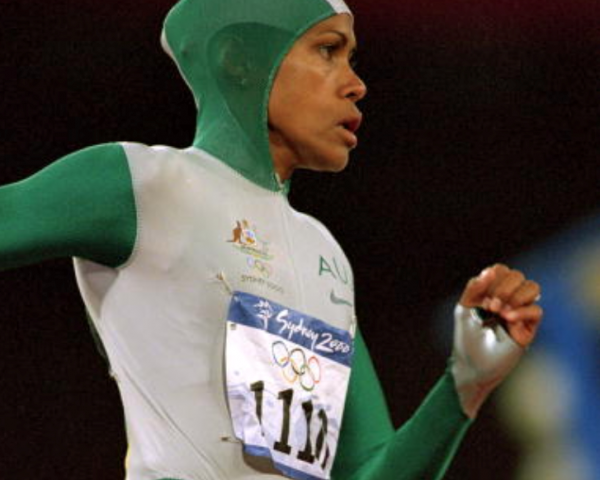 The design of these new outfits has not moved forward since Cathy Freeman’s supersuit at the Sydney Olympics in 2000. The design and idea was adopted by various sports stars (running and swimming) but how amazing would that supersuit be if it had been a riot of australian flora and fauna?
Other sporting codes have started to adopt indigenous design wear. Again this year, as part of the NRL’s Indigenous Round, each club will wear a themed jersey designed by Indigenous artists. The Jerseys represent the club’s colours and hopefully one day the NRL will consider adopting this style of jersey as the norm. An article in the Sydney Morning Herald discusses the story behind each jersey. The AFL followed suit and has a range of indigenous jerseys for sale, but only adopts the colours for special rounds.
While browsing the internet recently, my newsfeed was hit with a commercial for cycling gear (not that I have ever listed cycling as an interest!). The sponsored post was for a clothing supplier to the cycling fraternity,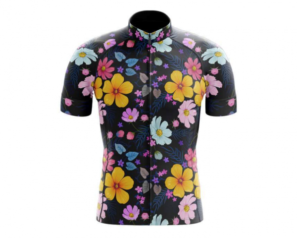 who has released a range of clothing that tells us that cycling wear doesn’t need to be boring. So are they on to something, or will cyclists the world over continue to wear predominantly black tights and tops emblazoned with company logos or printed with their own cycling clubs logo?
In the 80’s, those old enough, will remember a new fitness fad called aerobics. Aerobics, 80’s style was a fun mix of cardio and muscular strength and endurance which gave a total body workout and targeted all major muscle groups. As sweaty as it was, it was more about the work out gear than the routine. Men and women turned up in fluorescent colours, a mix and match of several hues in the one outfit. THere was none of this keeping blues with blues or all warm colours together rule. Outfits were put together to actually hurt the eyes. And then we added a plethora of accessories like legwarmers, head bands, wristbands and even belts!
Gym gear may have toned down a little but several years ago we saw an increase in well known brand joggers come out in all the colours of the rainbow. Are sports clothing companies not adopting radical design and colour changes because consumers aren’t buying in? Or are we not ready yet to move away from plain and boring? Whatever the reason, a word in the ear of the Olympic wear designers.
Go on a hike in the Australian outback or wilderness. Visit Arnhem land or the Daintree rainforest, even our reef and get high on the ideas that surround you in this beautiful country.
I’d rather an outfit that looks like a cassowary than the mundane yellow and gold our athletes have been forced to wear this year at the Tokyo Olympics.